
Data Entry: When Good Fields Make Bad Forms · Part 3 of 4
Mental Maps and Data Entry: How Users Shape the Form
The same spatial source can call for a different form depending on who is entering the data — and what happens when you hand an expert a second map.
We ended Part 2 with what looked like a useful rule: when the source contains meaningful spatial information, preserve it.
Now consider periodontal data collection. Several measurements per tooth. A full mouth. A specified order. Anatomy and spatial location everywhere.
Sounds perfect for a visual representation of the mouth.
Except now we must consider the person doing the work.
The Map May Already Be in Their Head
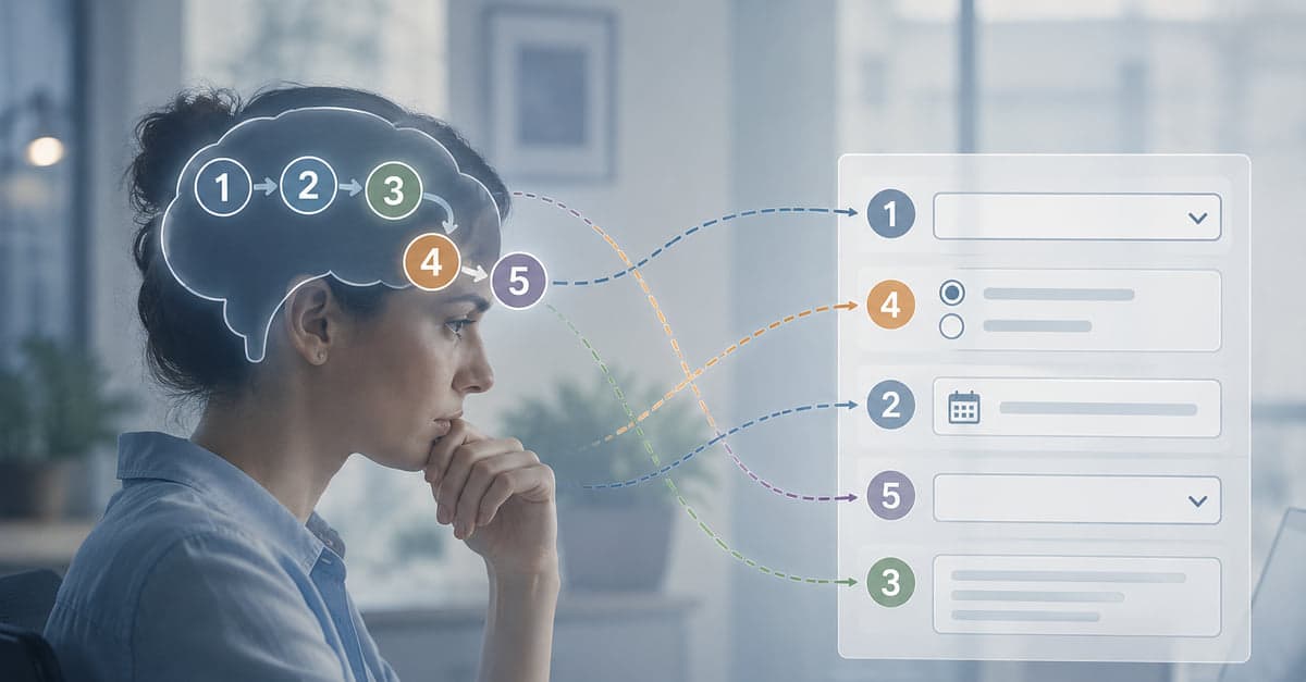
An experienced hygienist doesn't need a picture of a mouth to know where they are. They already have one.
The order of the teeth, where the examination starts, the sequence of measurements, and where it ends have been repeated so many times that the sequence itself has become a map.
Often two people are involved. One examines and calls out numbers. The other enters them. The person entering the data may barely look at the screen while the sequence is running: 3... 2... 4... 3...
Put a dental chart on the screen and ask that person to locate each measurement visually, and you've handed an expert a second map to interact with. Now they have to reconcile the one in their head with the one in front of them.
That's work the corneal rater needed and the periodontal team doesn't.
How Much of the Map Do They Already Carry?
That's the question that helps determine the design.
They already have it. An experienced hygienist working through a tooth sequence they know cold. Don't impose a second map. Match the sequence they already use and get out of the way.
They have part of it. Someone knows the anatomy or can identify the location but doesn't know the study's terminology, boundaries, or level of granularity. A reference image or a small amount of orientation may be enough.
They don't have it. A participant can point to where something hurts but doesn't know the anatomy. Or a coordinator may be transcribing a location from an image or report without the anatomical knowledge needed to orient themselves. Here, the form may need to provide the map.
Get this wrong in either direction and you've added work. Impose a map on someone who already has one and they spend attention reconciling the two. Withhold one from someone who needs it and they spend attention translating.
The same source may need a different form depending on who's entering the data.
When Does This Person Look at the Form?
There's another thing we need to know about the person, and it's easy to miss unless you watch the work.
In a well-practiced workflow like periodontal data entry, the person may not monitor the screen continuously. They sample.
They orient at the beginning: Am I in the right place? Then the familiar sequence runs. At a natural stopping point, they look again: Am I where I expect to be?
That's very different from someone checking the screen after every entry, and it suggests something important about form feedback: feedback isn't valuable simply because it's always visible. It needs to be available when the person uses it.
Give Them Landmarks
For periodontal entry, the characteristic error isn't necessarily entering an impossible number. It's getting off by one or two positions in the sequence. Once that happens, perfectly reasonable measurements can begin landing in the wrong fields.
And once you know that's the failure you're designing against, the form changes.
Keep the fields in the same sequence as the examination. Add visual outlines that allow someone to scan the sequence quickly. If there's a meaningful transition in the examination, give the eye somewhere to land there. A divider, spacing, or consistent change in color can create a landmark at the point where someone naturally reorients.
Now someone who glances at the screen has places to check: Am I where I expect to be? If the sequence has drifted, the design may help them notice before they get much farther.
Notice how different this is from the corneal example. Spatial correspondence reduces the opportunity for a mapping error. Sequence outlines don't prevent drift. They make drift easier to see.
Different failures. Different design responses. Understanding how the task fails helps tell you which tool you need.
Give the Eyes Somewhere to Land
The same thinking applies when the person is looking at the screen continuously. Consider a matrix.
Read the question on the left. Move across several response columns. Choose an answer. Return to the left for the next question. Do that enough times and the rows start to look alike.
A characteristic failure is simple: the right response goes into the wrong row.
Icons in the left column can give each row a distinct anchor, so the eye returns to something recognizable rather than a wall of similar text. A head for understanding. An ear for hearing.
But only when the mapping is obvious. Look at the hand used for remember on that form. A hand doesn't mean memory to most people. An icon someone must decode has simply replaced one kind of work with another.
Again, the question isn't whether icons are good. It's whether these icons help this person do this task.
Sometimes the Form Should Match the Person, Not the Anatomy
Laterality provides another good example.
Suppose the subject is sitting across from the assessor. The assessor already works from that clinical presentation and has a familiar way of orienting right and left. We can arrange the form around that view.
Medial variables can appear toward the middle of the form, with lateral variables toward the outside. Right and left can be positioned the way the assessor encounters them rather than according to an abstract convention. Color can further separate the sides so the association becomes easy to recognize after a few uses, particularly for someone who already has a versed mental map.
The point isn't that every laterality form should use one orientation. Instead, preserve the orientation the person already works from rather than making them mentally reverse it.
That's the lesson the corneal example couldn't teach us by itself. The source matters, but so does the person looking at it.
What Else Is the Person Doing?
So far, we've mostly looked at the work of getting an observation into the correct field. But some work is required by the source, some by the protocol, and some is created by the form.
The person may have to remember exactly how the study defines a variable. They may need to look something up. They may have to calculate something, determine a sequence, or follow a procedure before there's even a value to enter.
So here's the next question: How much of that work does the person need to do at all?
That's where Part 4 goes next.
All parts in this series
Data Entry: When Good Fields Make Bad Forms
We are much better at the data half of data entry than the entry half. A four-part series on designing better forms by considering where the information comes from, what it takes to turn it into data, and who is doing the work.
Shaping Up Data-Entry Forms: Designs That Put In the Work
The source, the task, and the person — a framework for the entry half of data entry.
Eyes vs. Fingers: The Battle Royale of Data Entry Accuracy
Two forms, the same ten ratings, and a very different amount of work.
Mental Maps and Data Entry: How Users Shape the Form
Why the same spatial source can need a different form depending on who is entering it.

Data Entry: Making the Form Do the Work
Display the work, support the work, or let the form do part of it.
Designing something like this yourself?
Tell us what you are building and we will show you how it maps onto Studytrax.
Get started