
Show Me the Data: Clinical Report Design Techniques · Part 3 of 5
Clinical Report Design: Connecting Big and Small Pieces
Years of clinical data can be difficult to understand one value at a time. Part 3 looks at how a report can summarize accumulated information and selectively bring forward current values, meaningful changes, and individual findings without losing access to the underlying details.
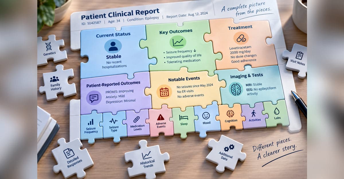
The longer we collect data, the more pieces we have to work with.
A patient registry may contain years of assessments, scores, symptoms, treatments, events, laboratory results, patient-reported outcomes, and other observations. Each piece can be useful, but looking at them one at a time doesn't necessarily give us a clear picture of the patient.
Part 1 dealt with the broad design decision of what deserves the foreground. With longitudinal data, we can go a step further. The report itself can use the accumulated data to determine what should come forward.
It can calculate a current state. Identify change. Extract particular responses. Summarize a history. Surface exceptions.
A useful clinical report can therefore do both: bring the pieces together while still letting us see the individual pieces that matter.
Put the Pieces Together
Sometimes the first thing someone needs isn't another individual value. It's an answer to a broader question:
What's going on with this patient?
A summary can bring together information collected at different visits and points in time and turn it into a more useful clinical picture.
In an epilepsy registry, for example, individual data about seizure frequency, seizure types, medications, safety events, and patient-reported outcomes can be combined into a concise summary of the patient's current status.
The individual data haven't disappeared. We've simply assembled some of the pieces so the reader doesn't have to do it themselves.
But summarization introduces a trade-off.
A table generally shows us the values it contains. A summary interprets or compresses those values. If a rule or algorithm summarizes the data incorrectly, or fails to recognize an important pattern, a concise statement such as "seizures stable" can actually make the problem harder to notice. Once the report has supplied the conclusion, the reader has less reason to inspect the underlying observations.
That makes the connection between summary and detail particularly important.
Bring the Current Picture Forward
Historical information matters, but it doesn't necessarily deserve equal billing with what's happening now.
One useful approach is to design a summary table around the patient's current state.
The latest value can be brought forward. Previous values can remain available but become less visually prominent. Change can be calculated. The date of the most recent assessment can be shown. Summary statistics such as minimum, maximum, or mean can provide additional context when they're useful.
With a well-designed summary table, someone can quickly answer several questions:
What's the current value? Has it changed? When was it last measured? How does it compare with what we've seen before?
The history is still part of the picture. It just doesn't have to compete equally with the information someone is most likely to need first.
Don't Let the Big Picture Hide an Important Piece
Summarization has its own trade-offs. Consider a patient-reported outcome with ten or twenty individual questions. A total score is useful precisely because it compresses those responses into a single measure.
But sometimes an important piece can disappear inside that total. A patient might report a significant problem on one item even though the overall score doesn't immediately call attention to it.
Instead of requiring someone to inspect every response, the report can extract individual items that meet predefined criteria. The examples below show different ways of doing that. In the third example, only symptoms identified as problems are brought forward.
The overall score provides the summary. The extracted items help make sure an important individual response isn't lost inside it.
This is also one way to protect against the limitations of summarization. The report can show the big picture while deliberately preserving the pieces most capable of changing its interpretation.
Bring Forward What's Changed
The same idea can be applied to change.
When dozens of variables are collected repeatedly, the reader may not need to inspect every variable at every visit. Often the more useful question is simply:
What's different?
A report can bring forward information that has changed meaningfully while allowing stable information to recede.
That might include a newly abnormal laboratory result, a worsening symptom, a new diagnosis, a medication change, or a patient-reported outcome that has crossed a meaningful threshold.
Instead of making someone compare two sets of values one by one, the report can help identify the pieces that changed.
As with any selection rule, however, what counts as "changed" or "important" has to be chosen thoughtfully. The convenience comes from allowing the report to do some of the looking. The trade-off is that the report's rules influence what the reader sees first.
Keep the Other Pieces Within Reach
Not every piece needs to be prominent, but that doesn't mean it needs to disappear.
A clinical report can provide layers. A summary presents the assembled picture. Selected findings draw attention to the individual pieces that deserve a closer look. Detailed tables, historical values, or an appendix can preserve the rest for someone who wants to investigate further.
This is particularly useful in registries, where years of accumulated information can make a completely detailed report unwieldy.
The goal isn't to choose between summary and detail. It's to connect them.
A good clinical report helps someone see the picture, notice the pieces that matter, and reach the rest when they need them.
So far, we've largely been working from the individual pieces inward: deciding what matters, choosing representations, and deciding what should be summarized or brought forward.
There is another level of design: How should the entire report be organized around the way someone understands the patient or the task they're trying to accomplish?
All parts in this series
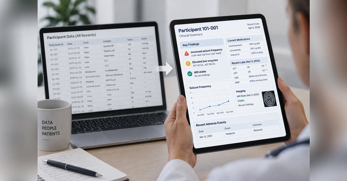
Show Me the Data: Clinical Report Design Techniques
Collecting clinical data is one thing. Turning it into something people can quickly understand and use is another. This series explores practical approaches to clinical report design, from predictable, programmatic reports to AI-generated reports that adapt to the data and what matters for each patient.
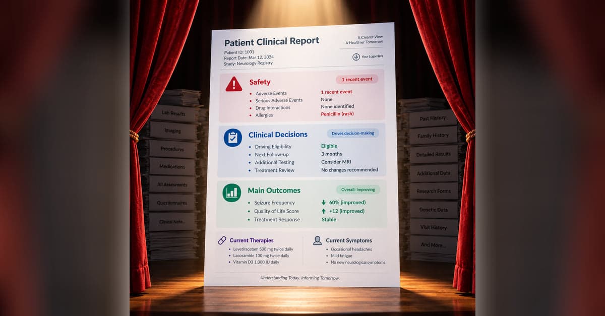
Clinical Report Design: What Belongs on Stage?
A clinical report can contain everything and still make the important information hard to find. Part 1 looks at how to decide what belongs in the foreground, what can recede into the background, and how to keep the details available when someone needs them.

Clinical Report Design: Ingredients of a Good Recipe
Once you've decided what belongs on a clinical report, the next challenge is deciding how that information should be represented. Part 2 looks at how color, spatial relationships, graphs, tables, timelines, and other visual cues can make meaning in the data easier to see.
Clinical Report Design: Connecting Big and Small Pieces
Years of clinical data can be difficult to understand one value at a time. Part 3 looks at how a report can summarize accumulated information and selectively bring forward current values, meaningful changes, and individual findings without losing access to the underlying details.
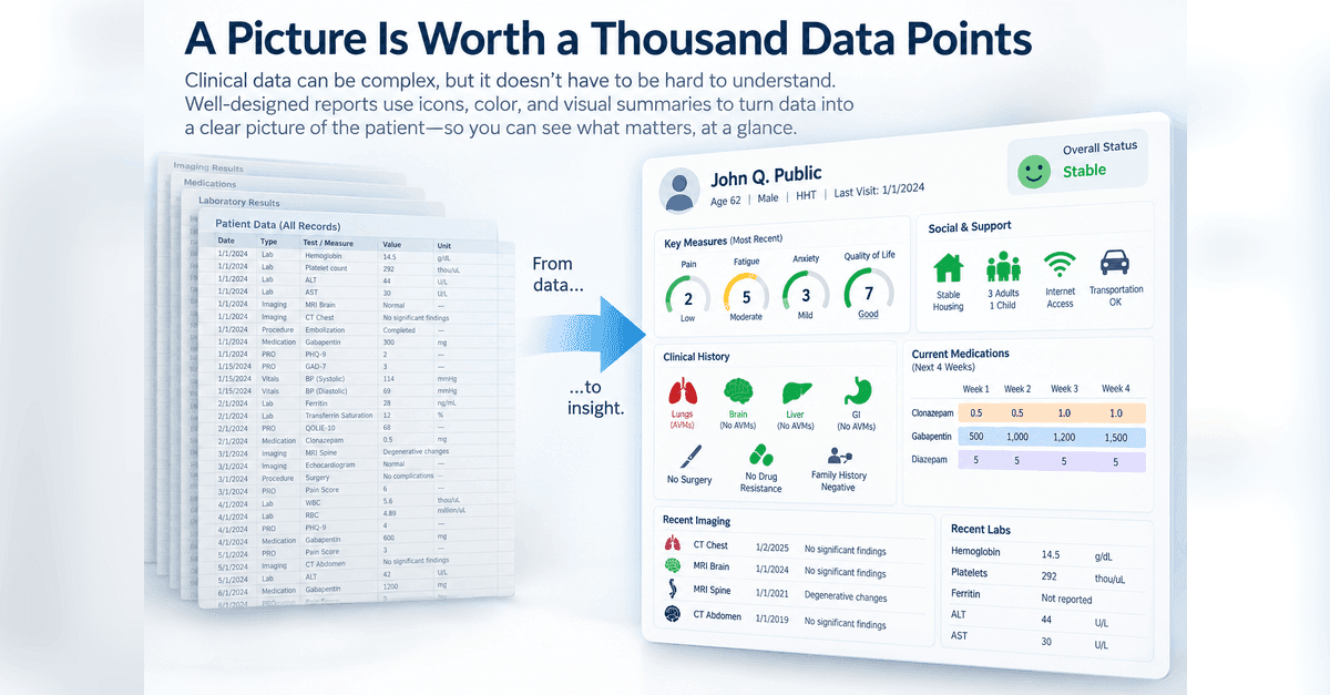
Clinical Report Design: A Picture Is Worth a Thousand Data Points
Clinical reports don't always need to make someone read numbers, scores, and text to understand what's happening. Part 4 looks at how visual representations can be combined into a larger picture organized around how someone understands the patient or what they need to do.
Clinical Report Design: When AI Joins The Team
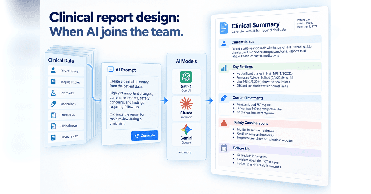
AI gives us a new way to turn clinical data into something people can use, but it also changes who is making some of the design decisions. Part 5 looks at two approaches: giving AI detailed instructions for structured clinical notes and reports, or giving it more freedom to decide how information should be organized and visualized, while keeping verification, reproducibility, and human review in view.
Designing something like this yourself?
Tell us what you are building and we will show you how it maps onto Studytrax.
Get started