
Show Me the Data: Clinical Report Design Techniques · Part 1 of 5
Clinical Report Design: What Belongs on Stage?
A clinical report can contain everything and still make the important information hard to find. Part 1 looks at how to decide what belongs in the foreground, what can recede into the background, and how to keep the details available when someone needs them.
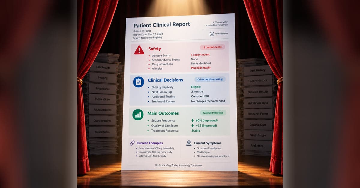
A patient registry may contain years of information about a participant. Medications, procedures, assessments, symptoms, laboratory results, patient-reported outcomes, clinical events, and hundreds of other values may all be available when it is time to generate a clinical report.
And we can put all of it on the report. In fact, imagine doing exactly that. Take a patient with years of seizure history and produce a perfectly accurate report containing every imaging study, treatment, medication, laboratory result, interview response, and clinical finding.
Nothing has to be wrong with this report. The information can be accurate, complete, and neatly organized.
Now try to answer a simple question: Where has this patient's epilepsy manifested, and what should I pay attention to?
Having the information and being able to use the information are two different things.
One of the first decisions in clinical report design is what comes to the foreground and what recedes into the background. What belongs on stage because it helps someone quickly understand the patient or make a decision? What can stay behind the scenes until someone needs it?
Put everything on stage and you haven't really prioritized anything. You've simply handed the job of sorting through the data to the person reading the report.
Start With the End in Mind
Before deciding what belongs on stage, think about what you want the report to accomplish.
What should someone understand after looking at it? Is there a decision they need to make? A question they need answered? Something they need to do? Or is the goal to inform or educate?
A clinician may need to quickly understand the patient's current status, identify an important change, or make a treatment decision. A participant may want to understand how their symptoms have changed, see their progress, or better understand what their results mean.
Once the end is clear, deciding what belongs on stage becomes considerably easier.
That question will come up throughout this series:
What are we trying to help someone understand or do?
What Earns a Place on Stage?
There isn't a universal list. What matters depends on the disease, the purpose of the report, and the person using it. But some generally applicable categories include:
- Key outcomes
- Current complaints and symptoms
- Current therapies and medications
- Safety information
- Abnormal or out-of-range findings
- Unexpected results
- Meaningful changes or trends
- New diagnoses, procedures, or clinical events
- Patient priorities
- Information requiring follow-up
- Information needed for an important clinical decision
Other information may deserve prominence because of its clinical significance even if it doesn't fit neatly into one of these categories. Reported drug or substance misuse, for example, may need to be difficult to overlook.
The point isn't to create another checklist. It's to ask why a particular piece of information deserves someone's attention.
Not Everything Gets Equal Billing
Sometimes what deserves the stage becomes obvious when you think about a specific clinical decision.
In one registry, clinicians needed particular information when determining whether a patient could have their driving privileges reinstated. Rather than asking someone to find the relevant information among everything else collected by the registry, the report brought the information needed for that decision together and gave it prominence.
The same principle can apply to what matters to the participant.
In another section of the report, concerns identified by the patient were ranked so that the highest-priority concerns received greater prominence. Instead of treating every reported concern equally, the report helped bring the patient's priorities to the foreground.
What gets priority will vary from report to report. Safety may come first in one setting. Disease progression may dominate another. In another, the report may be built around a handful of decisions clinicians make repeatedly.
The important thing is that the report does some of the prioritizing before it reaches the person using it.
Sometimes Less Says More
Bringing the right information forward also means allowing other information to recede.
Consider a safety section containing a number of possible clinical events. If none has occurred, we could display every possible event followed by "No," "None," or an empty value.
Or we can simply communicate that there are no events to report.
When something does occur, the relevant information can expand into view.
There is an important distinction to preserve, however. "No events occurred" is not the same as "we don't know whether an event occurred." If a report suppresses negative values, it still needs some way to distinguish information that was collected and found to be negative from information that was never collected or remains incomplete.
Minimization should remove unnecessary reading, not meaningful information about the data themselves.
The same idea can make a dramatic difference with something like family history.
One registry collected information on more than 100 diseases, diagnoses, and procedures across multiple family members. Putting all of those possibilities on the report would produce an impressive amount of information and a fairly miserable report.
Instead, the report can bring forward the positive history and the details that accompany it.
The information hasn't disappeared. We've simply stopped making the reader work through information that isn't currently useful.
Keep the Details Backstage
Of course, our best guess about what belongs on stage won't always be right.
Some seemingly minor field value may suddenly become important. Someone may want to see an older laboratory result, the response to a particular questionnaire item, or details about an event that occurred several years ago.
A clinical report can accommodate both needs.
The main portion can be designed for quick understanding, bringing forward the information most likely to matter. Farther down, a details section or appendix can provide much more of the underlying data.
That part of the report doesn't need to compete for attention. A straightforward table may be exactly what someone needs when they are deliberately hunting for a particular piece of information.
The key is orientation. Clear sections, labels, dates, and organization should make it reasonably easy to get to the right place and find the detail.
A timeline provides a good example. The main report might provide a concise view of important events across the participant's history, while an appendix provides the underlying details for someone who wants to investigate an individual event.
This gives us some insurance against our own decisions. Not everything needs to be on stage for everything to remain available.
What Belongs on Stage?
Good clinical report design starts with a fairly simple question: What are we trying to help someone understand or do?
From there, we can decide what deserves the foreground, what can recede, and what should remain backstage until someone goes looking for it.
Once we've decided what belongs on stage, the next question is how to represent it.
All parts in this series
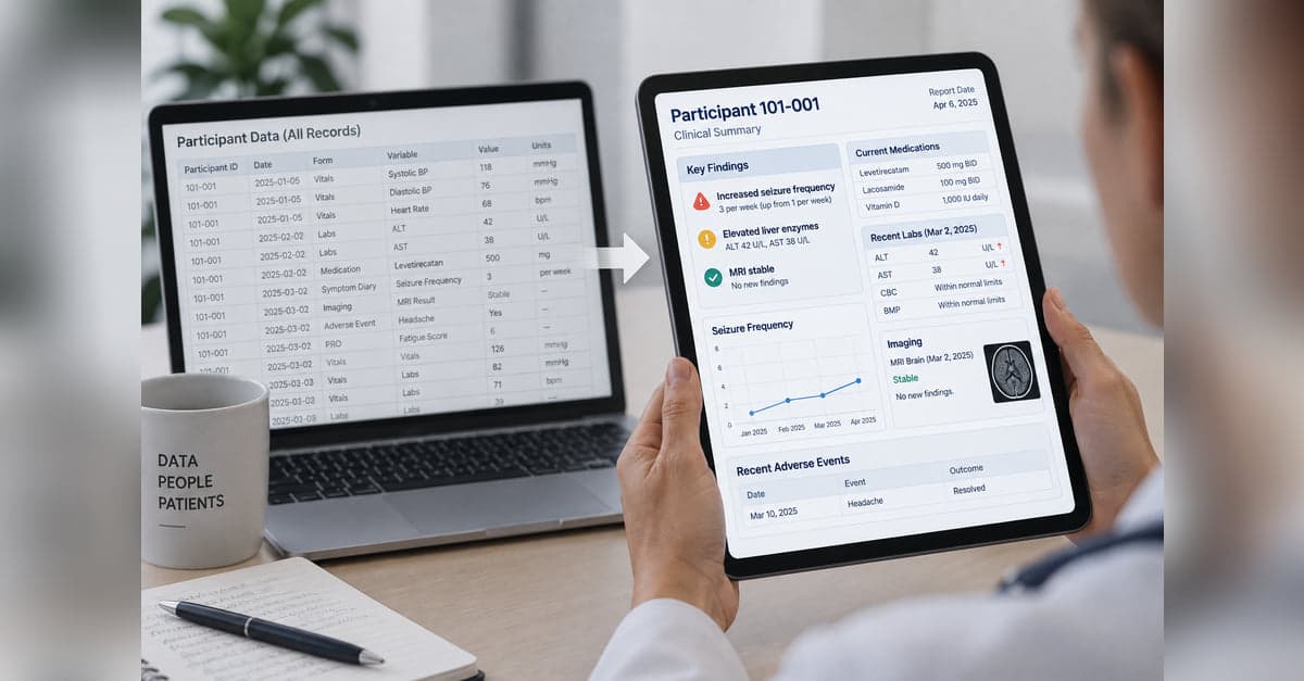
Show Me the Data: Clinical Report Design Techniques
Collecting clinical data is one thing. Turning it into something people can quickly understand and use is another. This series explores practical approaches to clinical report design, from predictable, programmatic reports to AI-generated reports that adapt to the data and what matters for each patient.
Clinical Report Design: What Belongs on Stage?
A clinical report can contain everything and still make the important information hard to find. Part 1 looks at how to decide what belongs in the foreground, what can recede into the background, and how to keep the details available when someone needs them.

Clinical Report Design: Ingredients of a Good Recipe
Once you've decided what belongs on a clinical report, the next challenge is deciding how that information should be represented. Part 2 looks at how color, spatial relationships, graphs, tables, timelines, and other visual cues can make meaning in the data easier to see.
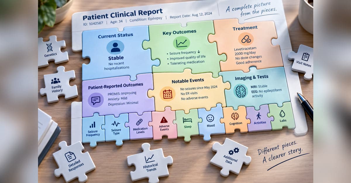
Clinical Report Design: Connecting Big and Small Pieces
Years of clinical data can be difficult to understand one value at a time. Part 3 looks at how a report can summarize accumulated information and selectively bring forward current values, meaningful changes, and individual findings without losing access to the underlying details.
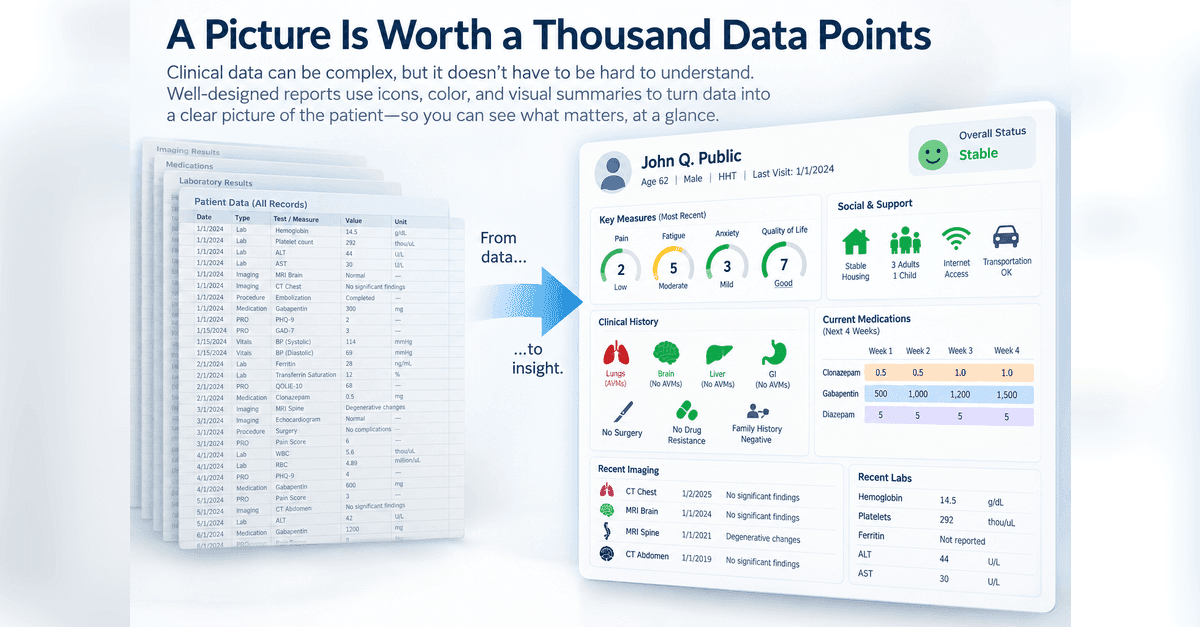
Clinical Report Design: A Picture Is Worth a Thousand Data Points
Clinical reports don't always need to make someone read numbers, scores, and text to understand what's happening. Part 4 looks at how visual representations can be combined into a larger picture organized around how someone understands the patient or what they need to do.
Clinical Report Design: When AI Joins The Team
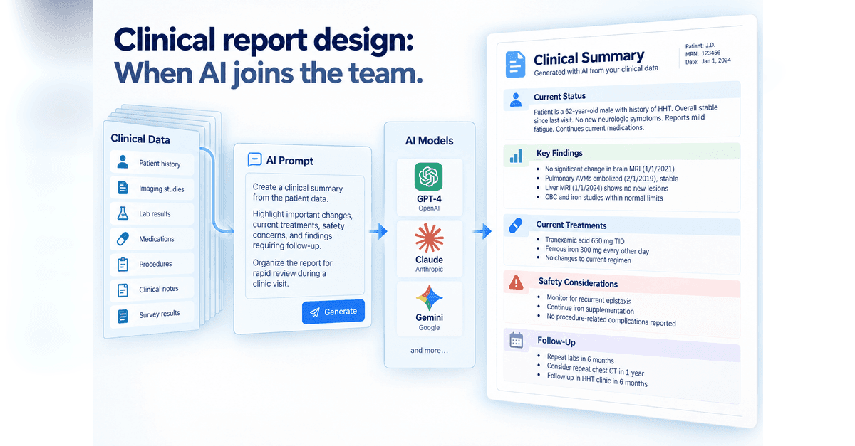
AI gives us a new way to turn clinical data into something people can use, but it also changes who is making some of the design decisions. Part 5 looks at two approaches: giving AI detailed instructions for structured clinical notes and reports, or giving it more freedom to decide how information should be organized and visualized, while keeping verification, reproducibility, and human review in view.
Designing something like this yourself?
Tell us what you are building and we will show you how it maps onto Studytrax.
Get started