
Show Me the Data: Clinical Report Design Techniques · Part 2 of 5
Clinical Report Design: Ingredients of a Good Recipe
Once you've decided what belongs on a clinical report, the next challenge is deciding how that information should be represented. Part 2 looks at how color, spatial relationships, graphs, tables, timelines, and other visual cues can make meaning in the data easier to see.
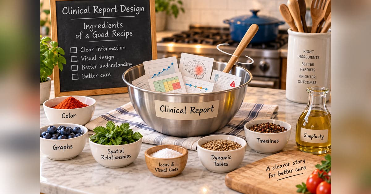
Once you've decided what belongs on the report, the next question is how to present it.
There are plenty of ingredients available. Color can direct attention. A graph can make a trend visible. Spatial relationships can show where something occurred. Tables can organize a lot of information into a small amount of space.
As with any recipe, the goal isn't to use every ingredient. It's to use the ones that help someone understand what's in front of them.
Add Color With a Purpose
Color is one of the easiest ingredients to add to a clinical report. It's also one of the easiest to overdo.
Used selectively, color can make interpretation almost immediate. It can distinguish categories, indicate severity, identify something that needs attention, or help someone recognize the same type of information across a report.
The family history report from Part 1 is a simple example. Green indicates no reported diagnoses, yellow indicates one or two, and red indicates three or more.
You don't have to read every diagnosis to get an initial sense of where the family history is concentrated. The details remain available, but color provides another layer of information.
The colors themselves don't have to be dramatic. In many reports, muted colors work better. The goal is to communicate, not decorate.
Use Space When the Information Is Spatial
Some clinical information already has a meaningful location. When it does, keeping that relationship can make the information much easier to understand.
In one epilepsy registry, seizure onset was displayed on an image of the brain. Instead of reading a description of the location and mentally translating it, the clinician could see where the seizure was believed to originate.
The same idea can work with tumors, lesions, pain, wounds, anatomical findings, or almost anything else where where it happened is part of the information.
Sometimes a picture isn't an embellishment. It's simply a better container for the data.
Let Graphs Show the Pattern
A table of values can tell you what happened.
A graph can sometimes let you see it.
That's particularly useful when the important information isn't a single value but change over time. Is the patient improving? Getting worse? Staying stable? Did something change after treatment?
There is also a small design issue here that can make a big difference when several measures are shown together.
Suppose improvement means a higher score on one measure but a lower score on another. If the graphs are displayed together without accounting for that difference, the reader has to remember whether "up" is good or bad for each one.
When appropriate, measures can be oriented so the same visual direction carries a similar meaning.
Now the shape of the data starts doing some of the explaining.
Make Tables More Than Tables
Tables are useful because they can fit a lot of information into a relatively small space. But they don't have to be nothing more than rows and columns.
Formatting can respond to the information inside a cell.
A background can change. A border can appear. An icon can be displayed. Text can receive additional emphasis. Several pieces of related information can even be represented within the same cell.
That can make a table much easier to scan. Instead of reading every value with equal attention, the visual characteristics of the table can help direct the reader toward what deserves a closer look.
The underlying values are still there. We're simply helping the eyes know where to go.
Put Several Ingredients Together
Individual visual elements can help someone interpret individual pieces of information. Often, though, the larger payoff comes when several elements are composed so that relationships between pieces of information become visible.
A timeline is a good example. Position can tell us when something happened. Color can tell us what kind of event it was. Symbols can distinguish one category from another. A bar can show how long a treatment or event lasted.
Time itself can also be an important part of the information. A timeline can help someone see sequence, duration, recency, and relationships: what happened first, how long something lasted, how recently something occurred, and what else was happening around the same time.
That becomes particularly useful when different kinds of clinical information need to be understood together.
Here, tumors, surgeries, systemic therapies, radiation, responses, toxicities, and other events all share the same clock. Instead of reconstructing the patient's history from separate dates and tables, the reader can see how events line up over time.
A timeline doesn't establish that one event caused another. But putting events on the same time scale can make potentially important relationships visible enough to investigate.
This is an important step beyond making an individual value easier to interpret. The composition itself can reveal relationships that are difficult to see when the pieces are presented separately.
Don't Overcook It
There's a temptation once you start adding visual elements to keep going.
Another color. Another icon. Another graph. Another callout.
Eventually, the things intended to direct attention can start competing for it.
There can also be a learning cost. An icon or color scheme is only useful if the person understands what it means. Someone who uses a report every day may quickly learn a fairly rich visual language. Someone who sees it twice a year may not.
A good clinical report doesn't need to demonstrate every visualization technique available. It needs to help someone understand the information.
Sometimes that means color. Sometimes a graph. Sometimes a picture. Sometimes a carefully designed table.
And sometimes the best ingredient is simply white space.
The recipe will be different for every report. The test is whether each ingredient makes the information easier to find, understand, or use.
All parts in this series
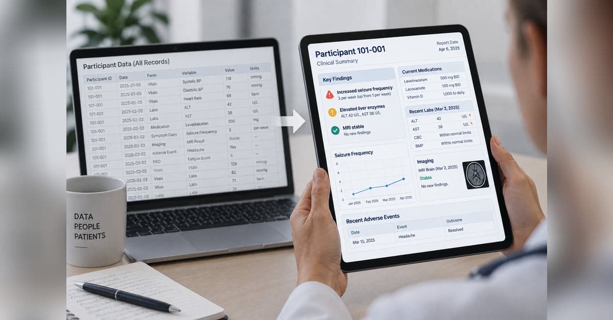
Show Me the Data: Clinical Report Design Techniques
Collecting clinical data is one thing. Turning it into something people can quickly understand and use is another. This series explores practical approaches to clinical report design, from predictable, programmatic reports to AI-generated reports that adapt to the data and what matters for each patient.
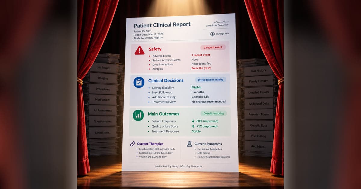
Clinical Report Design: What Belongs on Stage?
A clinical report can contain everything and still make the important information hard to find. Part 1 looks at how to decide what belongs in the foreground, what can recede into the background, and how to keep the details available when someone needs them.
Clinical Report Design: Ingredients of a Good Recipe
Once you've decided what belongs on a clinical report, the next challenge is deciding how that information should be represented. Part 2 looks at how color, spatial relationships, graphs, tables, timelines, and other visual cues can make meaning in the data easier to see.
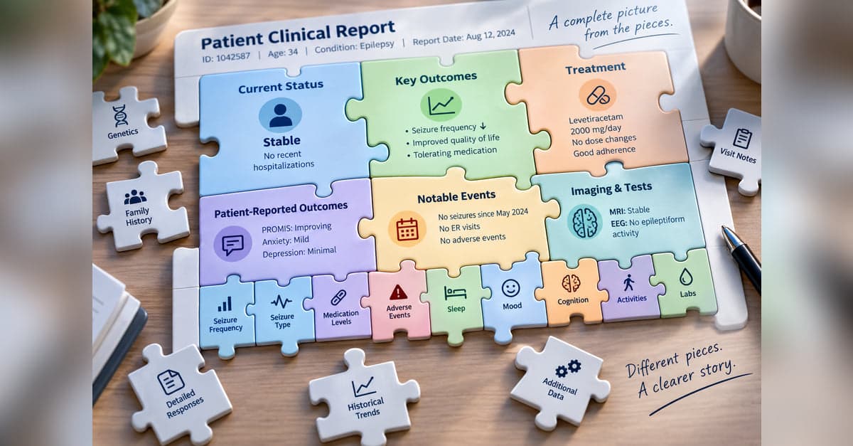
Clinical Report Design: Connecting Big and Small Pieces
Years of clinical data can be difficult to understand one value at a time. Part 3 looks at how a report can summarize accumulated information and selectively bring forward current values, meaningful changes, and individual findings without losing access to the underlying details.
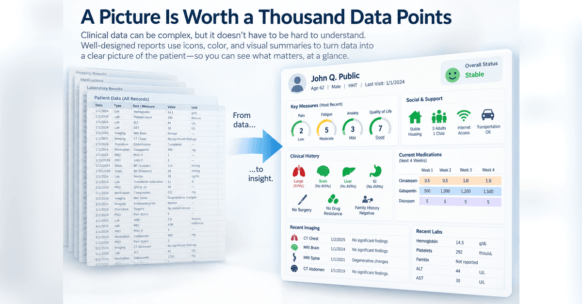
Clinical Report Design: A Picture Is Worth a Thousand Data Points
Clinical reports don't always need to make someone read numbers, scores, and text to understand what's happening. Part 4 looks at how visual representations can be combined into a larger picture organized around how someone understands the patient or what they need to do.
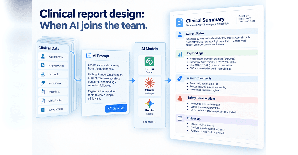
Clinical Report Design: When AI Joins The Team
AI gives us a new way to turn clinical data into something people can use, but it also changes who is making some of the design decisions. Part 5 looks at two approaches: giving AI detailed instructions for structured clinical notes and reports, or giving it more freedom to decide how information should be organized and visualized, while keeping verification, reproducibility, and human review in view.
Designing something like this yourself?
Tell us what you are building and we will show you how it maps onto Studytrax.
Get started