
Show Me the Data: Clinical Report Design Techniques · Part 4 of 5
Clinical Report Design: A Picture Is Worth a Thousand Data Points
Clinical reports don't always need to make someone read numbers, scores, and text to understand what's happening. Part 4 looks at how visual representations can be combined into a larger picture organized around how someone understands the patient or what they need to do.
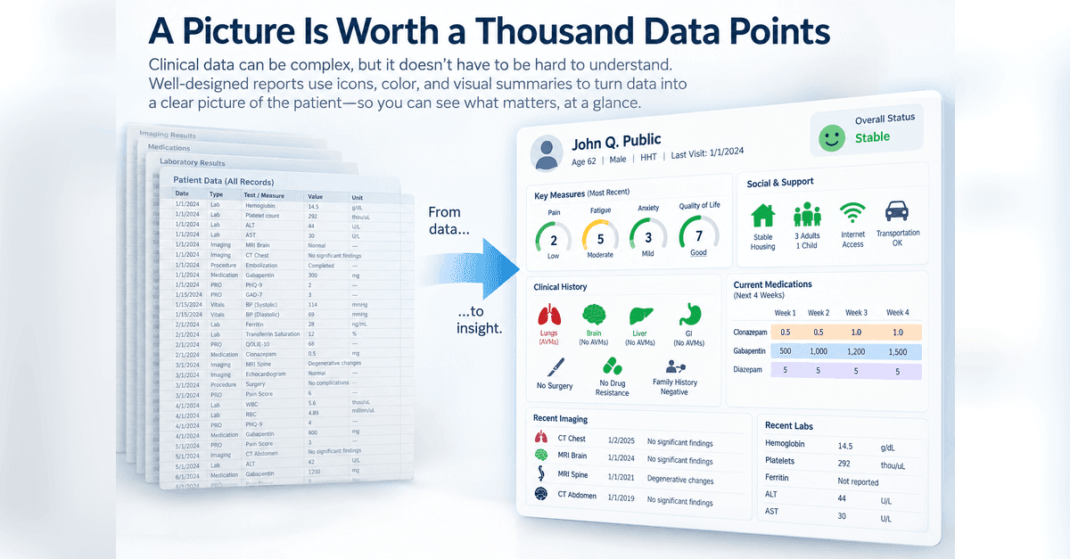
Clinical data tend to arrive as numbers, categories, dates, and text. That's how we store them, but it doesn't have to be how we present them.
Sometimes a number is exactly what someone needs. Other times, an icon, color, position, or simple visual summary can communicate the information much faster.
The goal isn't to decorate the report. It's to reduce how much of the report someone has to read.
But there is a larger opportunity here too. Once individual pieces of information have useful visual representations, we can begin arranging those pieces around how someone thinks about the case or what they need to do, rather than simply around where the data happened to be collected.
Data Doesn't Have to Look Like Data
Consider something as simple as age.
A report can say that a patient is eight years old. Or it can pair that information with an image of a school-age child. A baby, toddler, teenager, and adult can each have their own visual representation.
The same approach can be used for clinical information. Family history, surgical history, drug resistance, social circumstances, symptoms, and other information can all be represented visually.
The underlying data haven't changed. We've changed their representation to fit the person using them.
That distinction becomes particularly useful as the amount of information grows. A report filled with dozens of labels and values asks someone to read and interpret each one. Visual representations can make some of those interpretations available before the details are read.
Here, information about the patient's home, household, internet access, transportation, education, socialization, stress, and other needs can be represented with a combination of icons and color.
The details can still be available. They just don't all have to compete for the reader's attention in the same way.
Create a Visual Language
Visual elements become more useful when their meaning is consistent.
Green, yellow, orange, and red can represent increasing levels of concern. An icon can consistently represent an organ system, clinical domain, or patient characteristic. A gauge can provide a common way of interpreting measures that otherwise use very different scoring systems.
Patient-reported outcomes provide a good example.
One measure might range from 0 to 27. Another might range from 0 to 100. Higher scores can be better on one measure and worse on another. Put all of the raw scores next to each other and the clinician may need to remember how each instrument works before the numbers mean very much.
Instead, the interpretation can be translated into a common visual language (see Key Measures area in above report).
The measures themselves haven't been made equivalent. Their scoring systems haven't changed. But the gauges give the reader a common way to see whether a particular result is relatively reassuring or deserves attention.
The same idea can be applied within a more complicated measure.
Here, the overall quality-of-life score can be accompanied by visual summaries of seizure worry, emotion, energy, cognition, medication effects, social functioning, and other domains.
Once the reader learns the visual language, the report becomes easier to scan.
That last point matters. A visual language has a learning cost. A frequent user may quickly recognize its icons, colors, and conventions. An occasional user may not. Visual representations work best when their meaning is intuitive enough to recognize or consistent enough to learn.
Organize Around How Someone Thinks About the Case
This is where visual reporting becomes more than replacing words or numbers with pictures.
Most clinical data are naturally organized around where they were collected. Imaging goes in one place. Laboratory results go somewhere else. Procedures have their own table. Medications have another. Patient-reported outcomes may live in yet another section.
But that's not necessarily how someone thinks about the patient.
Consider a patient with hereditary hemorrhagic telangiectasia (HHT). Over many years, the registry may accumulate imaging, procedures, treatments, laboratory results, medications, diagnoses, and findings involving different organ systems.
One way to begin organizing that history is with the patient themselves.
The organ systems provide a visual map. Brain, spine, liver, lungs, gastrointestinal tract, and other areas can each be represented consistently, with color indicating where findings have been identified.
Compare that with the conventional report at the beginning of Part 1. The underlying information may be the same. What has changed is the organizing question.
Instead of asking, "Where did we collect these data?" we're asking, "How does someone need to understand this patient?"
That overview can then lead into the supporting information.
Imaging can be organized with the most recent studies first, allowing someone to quickly find the latest relevant information while retaining the older history.
Treatment history can be organized separately from the medications the patient is currently taking.
Laboratory results can be grouped into clinically meaningful sections such as iron studies, CBC and liver function tests, again keeping the most recent information readily accessible.
None of these representations is especially complicated by itself. What matters is how they work together.
Instead of organizing the report around where each piece of information happened to be collected, the report can be organized around how someone needs to understand the case.
Organize Around What Someone Needs to Do
The same principle applies when the report needs to support a specific clinical task.
In one epilepsy practice, medication changes frequently involved titrating several medications over the four weeks following a clinic visit. The physician needed to prescribe those changes, but also wanted to visually check the plan while standing with the patient.
A conventional medication list wasn't necessarily the best representation of that task (see dosing section below).
By standardizing the report around the four weeks following the current visit, the physician can see the medication plan across time.
A medication might increase:
500 mg → 1,000 mg → 1,200 mg → 1,500 mg
Another might taper down. Another might remain unchanged.
The question the report helps answer is straightforward:
Did I get this right?
That's a different purpose from simply documenting which prescriptions were written.
And that's an important distinction. The medication data haven't changed. The report has become a different artifact because the question being asked has changed.
The same thing happened with the driving example in Part 1. The registry contains a great deal of information about the patient, but the driving section is organized around one recurring decision.
A useful question when designing an entire report, or even a section of one, is therefore:
What is this person trying to understand or do right now?
Let the Report Do Some of the Looking
There is another step we can take. Instead of simply presenting everything visually, the report can use the underlying data to determine what deserves to be brought forward.
A questionnaire is a good example. A participant may answer dozens of questions, but a clinician may be particularly interested in the responses indicating a problem or concern.
Rather than requiring someone to read every response, reported concerns can be grouped into recognizable domains such as mood, speech, memory, motor function, sensory function, and concentration. A more formal patient-reported outcome can use the same basic idea.
The overall score remains useful, but individual responses can be surfaced when they meet criteria that make them worth reviewing. The report can provide the summary while still pointing to the specific responses behind it.
The same approach can support data quality.
In this example, information reported during an interview can be compared with information documented elsewhere in the registry. Visual indicators can identify where corroborating information is present and where expected information may be missing.
Now the report isn't simply displaying the data. It's helping someone know where to look.
Build a Picture, Not Just a Report
None of this means replacing numbers, text, dates, or detailed clinical information. Sometimes those are exactly what someone needs.
The opportunity is to ask a different question:
Does the person really need to read this to understand it?
Sometimes the answer is yes. Sometimes an icon can communicate status. Color can draw attention. A gauge can translate an unfamiliar score. Anatomy can organize a clinical history. A visual schedule can make a treatment plan easier to check. A report can even identify which details deserve a closer look.
But the biggest opportunity may be broader than any individual technique.
Instead of allowing the structure of the database to determine the structure of the report, we can organize the report around the patient, the question, and the task.
Sometimes a picture really is worth a thousand data points.
All parts in this series
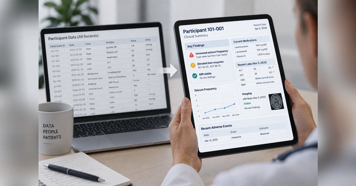
Show Me the Data: Clinical Report Design Techniques
Collecting clinical data is one thing. Turning it into something people can quickly understand and use is another. This series explores practical approaches to clinical report design, from predictable, programmatic reports to AI-generated reports that adapt to the data and what matters for each patient.
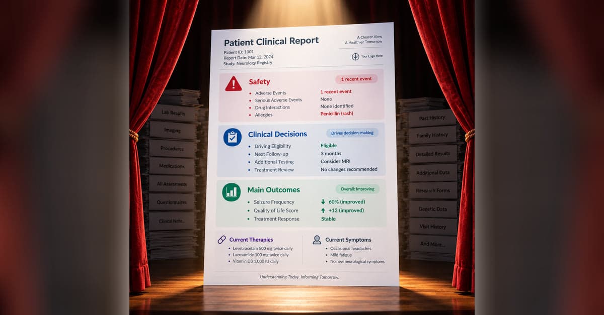
Clinical Report Design: What Belongs on Stage?
A clinical report can contain everything and still make the important information hard to find. Part 1 looks at how to decide what belongs in the foreground, what can recede into the background, and how to keep the details available when someone needs them.

Clinical Report Design: Ingredients of a Good Recipe
Once you've decided what belongs on a clinical report, the next challenge is deciding how that information should be represented. Part 2 looks at how color, spatial relationships, graphs, tables, timelines, and other visual cues can make meaning in the data easier to see.
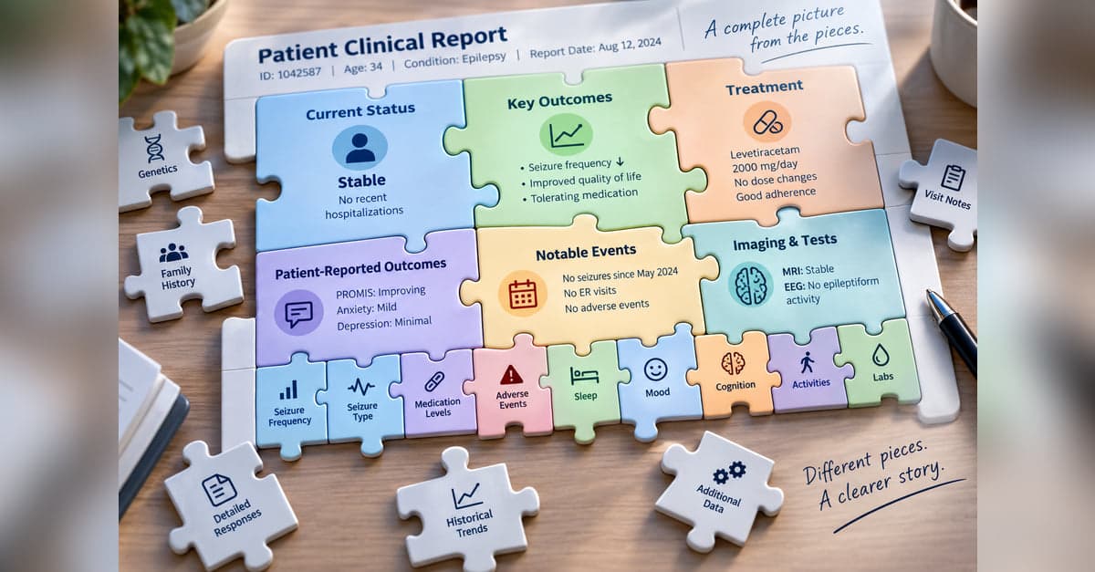
Clinical Report Design: Connecting Big and Small Pieces
Years of clinical data can be difficult to understand one value at a time. Part 3 looks at how a report can summarize accumulated information and selectively bring forward current values, meaningful changes, and individual findings without losing access to the underlying details.
Clinical Report Design: A Picture Is Worth a Thousand Data Points
Clinical reports don't always need to make someone read numbers, scores, and text to understand what's happening. Part 4 looks at how visual representations can be combined into a larger picture organized around how someone understands the patient or what they need to do.
Clinical Report Design: When AI Joins The Team
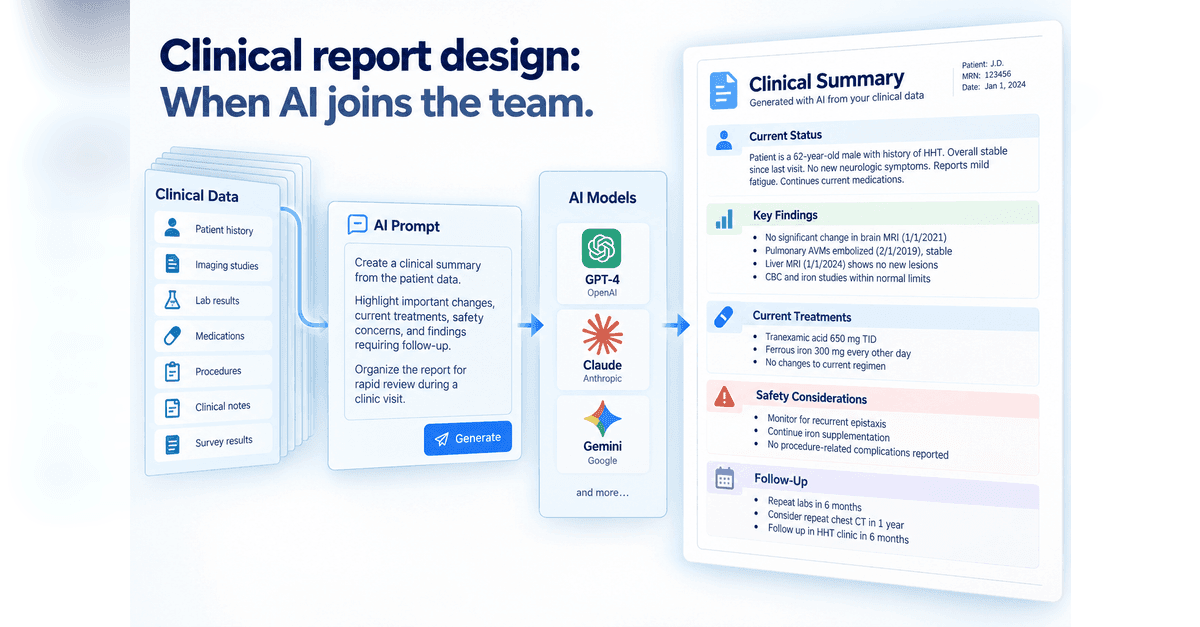
AI gives us a new way to turn clinical data into something people can use, but it also changes who is making some of the design decisions. Part 5 looks at two approaches: giving AI detailed instructions for structured clinical notes and reports, or giving it more freedom to decide how information should be organized and visualized, while keeping verification, reproducibility, and human review in view.
Designing something like this yourself?
Tell us what you are building and we will show you how it maps onto Studytrax.
Get started